

Content Management
The Content Management section is where you build and organize all structured learning content. It follows the content hierarchy of categories, modules, lessons, and steps, and also includes surveys, answer templates, survey visualizations, and availability settings. Expand Content Management in the sidebar to reach each page.
Navigating the CMS
Section titled “Navigating the CMS”Every edit page shows a breadcrumb bar at the top so you always know where you are in the hierarchy. Each level links back to its parent, making it easy to move between categories, modules, lessons, and steps.
Most list pages share a common layout: a status filter (Active, Inactive, or All), a data table, and page controls below the table. The categories list also has a search field, and the modules list can be filtered by category.
Module categories
Section titled “Module categories”Categories are the top-level grouping for modules. On the Module Categories page you can:
- Create a new category with the New Category button.
- Search categories by name and filter by status.
- Edit the sort order inline by changing the number in the Sort column.
- Select multiple categories and use the Activate or Deactivate buttons to change them at once.
When editing a category, the Details tab holds the name, subtitle, Show progress on home page (whether the category shows progress on the app’s home page), and Is Active. The Modules tab lists the modules in the category and has an Add Module button.
Modules
Section titled “Modules”Modules live inside categories. The Modules page displays each module with its picture, category, lesson count, sort order, and status badges (active/inactive, premium).
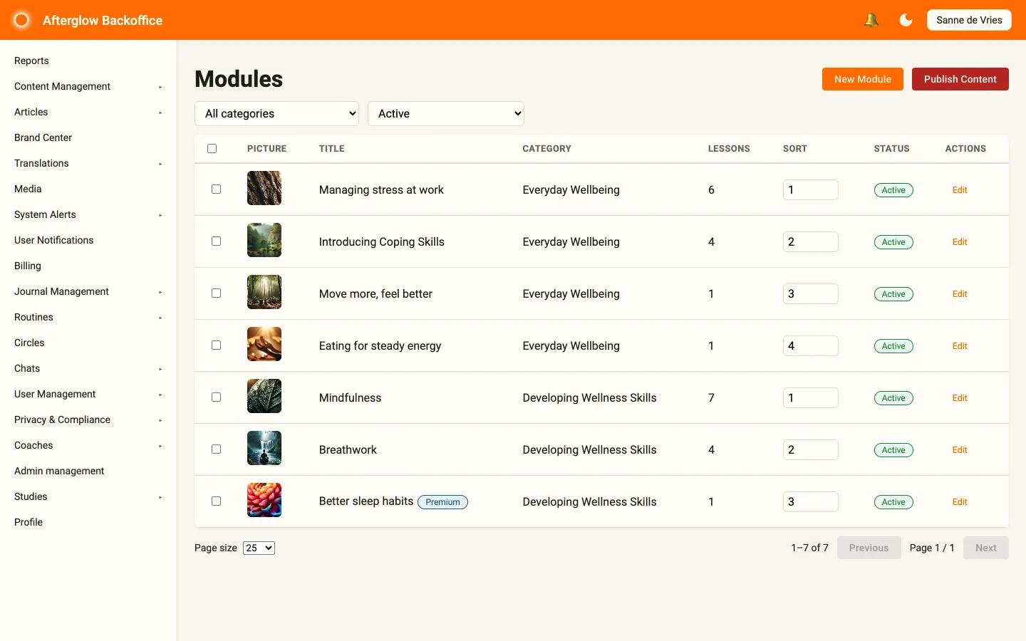
From the modules list you can:
- Create a new module with the New Module button.
- Filter by category and by status.
- Edit sort order inline.
- Bulk activate or deactivate selected modules.
When editing a module, the edit page is organized into tabs:
- Details — Title, subtitle, intro text, category, and the Is Premium and Is Active checkboxes. Title, subtitle, and intro text use multilingual text so you can provide each language the app supports.
- Media — Choose or change the module picture.
- Lessons — View, reorder, and open the lessons that belong to this module. Use Add Lesson to create a new lesson in this module.
Click Save to store your changes, Cancel to go back to the list, or Delete to remove the module.
Lessons
Section titled “Lessons”Lessons sit inside modules. The Lessons page shows each lesson with its module and category, step count, sort order, and status. New lessons are created from the Lessons tab of a module.
The lesson edit page has four tabs: Details (title and subtitle), Media (the lesson picture), Availability (choose an availability setting, or Always available), and Steps (the steps within the lesson, with an Add Step button). Title and subtitle use the same multilingual text field as modules.
Steps are the individual content items within a lesson. The Lesson Steps page lists every step with its lesson, module, and category, its type, sort order, and status. Each step has a Step type that determines its behavior:
- Exercise — Interactive exercise content.
- Survey — Embeds a survey for the user to complete.
- Informational — Read-only informational content.
- Link — Opens an external web page. Enter a full web address that starts with
http://orhttps://. Link steps have no audio, video, or survey.
The step edit page has three tabs: Content (title, step type, and the type-specific content such as text, audio, video, a background image, or a linked survey), Navigation (the next page button text and an optional next page URL), and Settings (Complete lesson on this step, and Allow survey retake for survey steps). Only the last step in a lesson can complete the lesson.
Link steps
Section titled “Link steps”You can write {{USER_ID}} anywhere in the web address of a Link step. When a participant opens the link, it is replaced with that participant’s unique, pseudonymised participant ID. The ID is the same every time for that person within your organisation, and it never contains their name or email address. This is useful for external studies or games that need to recognise the participant.
For example: https://example.com/study?participant={{USER_ID}}
You can also set a Link button text, the label on the button that opens the link. It is optional and uses multilingual text, like the next-page button text. If you leave it empty, the app shows its default label.
Choosing images for lesson steps
Section titled “Choosing images for lesson steps”Choose an image shape that matches how it will appear in the app. The step editor warns you when an image is a poor fit.
| Display mode | Recommended image |
|---|---|
| Content section | Portrait, roughly 5:7 — for example, 1000 × 1400 pixels. If the step includes audio, choose an image closer to square. |
| Full page | Tall portrait that matches a phone screen, roughly 9:19.5 — for example, 1170 × 2532 pixels. |
| Above text or Below text | Any shape. The image keeps its natural proportions; use an image at least 1200 pixels wide so it stays sharp. |
Images are never stretched or cropped. If an image does not match the recommended shape, the app fills the surrounding space with a softly blurred copy of the same image while keeping the primary image fully visible on phones.
Surveys
Section titled “Surveys”Surveys can be created and managed independently, then linked to steps of type Survey. The Surveys page lists all surveys with their question count and status. Click New Survey to create a survey called “New Survey” and open it, then give it a name on the Details tab and click Save. Use Duplicate on the Details tab to copy an existing survey.
The survey edit page has a Details tab and a Questions tab, where Add Question creates a new question. Each question has an answer group that defines the possible answers. Answer groups are managed on the Answer Templates page, so you can reuse the same set of answers across questions. Question text and answer options use multilingual text.
The Survey Visualizations page lets you build charts from survey answers.
Conditional questions
Section titled “Conditional questions”A question can be set to appear only when the answers to one or more earlier questions in the same survey match rules you choose. By default, every question is always shown.
Conditional questions use the same access as the rest of Content Management. Questions that already have answers are in use: their answer group is locked, and their conditions cannot be changed.
To set a condition, open a survey, open a question, and select the Display Condition tab next to Details and Answer Group.
Conditions can only be based on questions that come before this one in the survey. If there are no earlier questions, the tab explains that you need to save this question and add earlier questions first.
To add a condition:
- Tick Only show this question when conditions are met.
- Under Match, choose how the rules combine:
- All conditions (AND) — every rule must be true.
- Any condition (OR) — at least one rule must be true.
- For each condition, pick an earlier question, an operator, and a value.
- Use + Add condition to add more rules, or the × button to remove a row.
- Click Save.
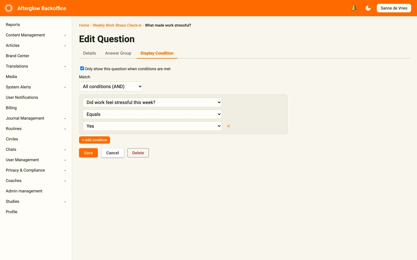
The operators work as follows:
- Equals / Not equals — pick one option the earlier answer must, or must not, match.
- Is one of — pick several options; the rule is met if the earlier answer matches any of them.
- Contains text — type text the earlier answer must contain (for typed answers).
In the app, the question appears only when its conditions are met. Otherwise it is skipped — the user never sees or answers it.
Availability settings
Section titled “Availability settings”Availability rules control when lessons unlock for users. The Availability Settings page lets you create named settings, each containing one or more rules.
- Create a new setting with the New Setting button.
- View the number of rules in each setting and the lesson that uses it.
- Delete a setting only when it is not in use by any lesson.
The setting edit page has a Details tab, which also lists the lessons using the setting, and a Rules tab where you add and edit rules. Once created, availability settings are assigned to individual lessons on the Availability tab of the lesson edit page.
Bulk actions
Section titled “Bulk actions”Most list pages support multi-selection. Select items using the checkboxes, then use the Activate or Deactivate buttons that appear next to the filters to change all selected items at once.