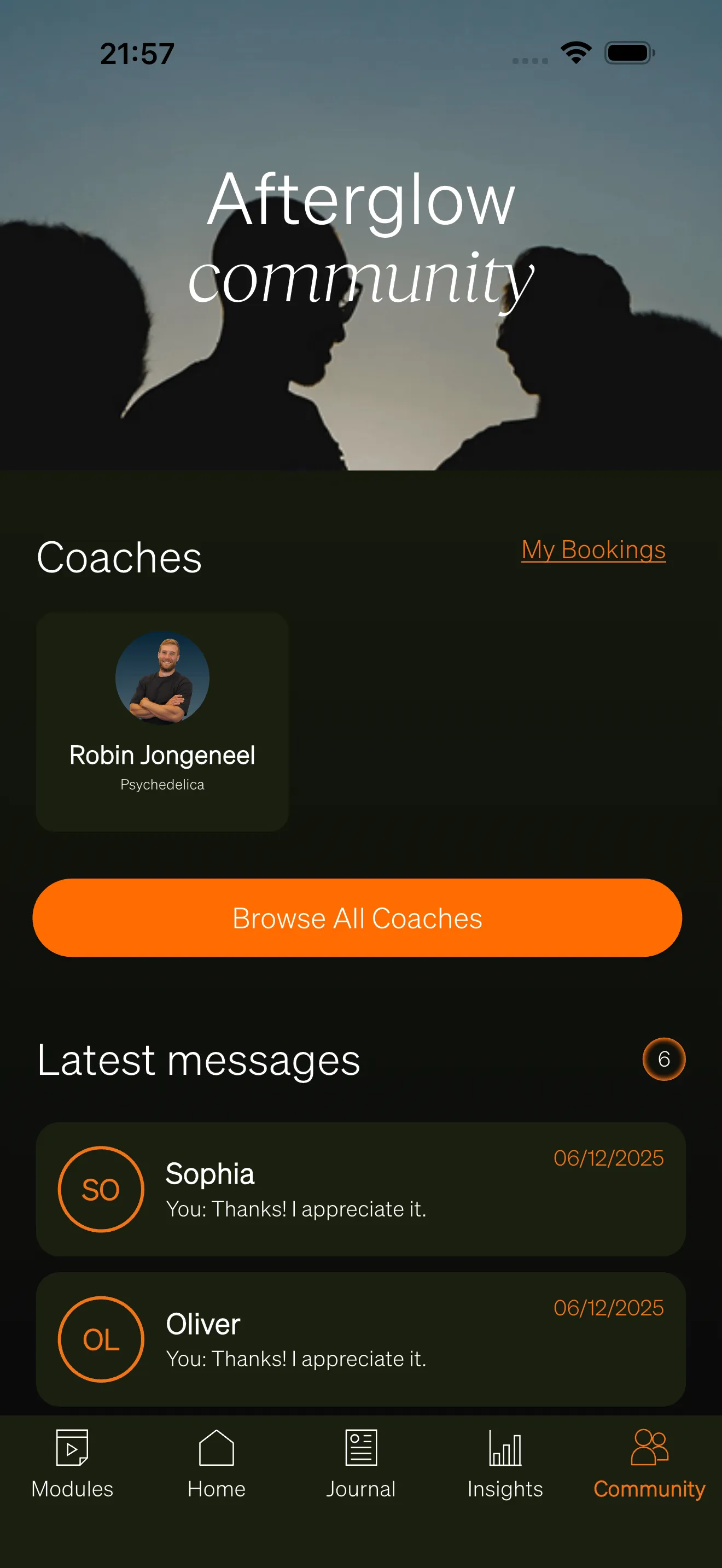
Community
The Community tab is where users connect with each other through messaging, articles, and group spaces called circles.
Community tab
Section titled “Community tab”The Community tab serves as a landing page that brings together all social features in one place. Depending on which features are enabled, the tab displays:
- Banner — A branded header image with a title and subtitle, customizable through the Brand Center.
- Articles section — A featured article and a link to browse all topics and articles.
- Circles section — A preview of circles the user belongs to (when the Circles feature is enabled).
- Coaches section — Available coaches and upcoming bookings (when the Coaches feature is enabled).
- Connected people — A horizontal list of users the person has chatted with (shown when chats are enabled but circles are not).
- Latest messages — The three most recent chat conversations with a link to view all chats.
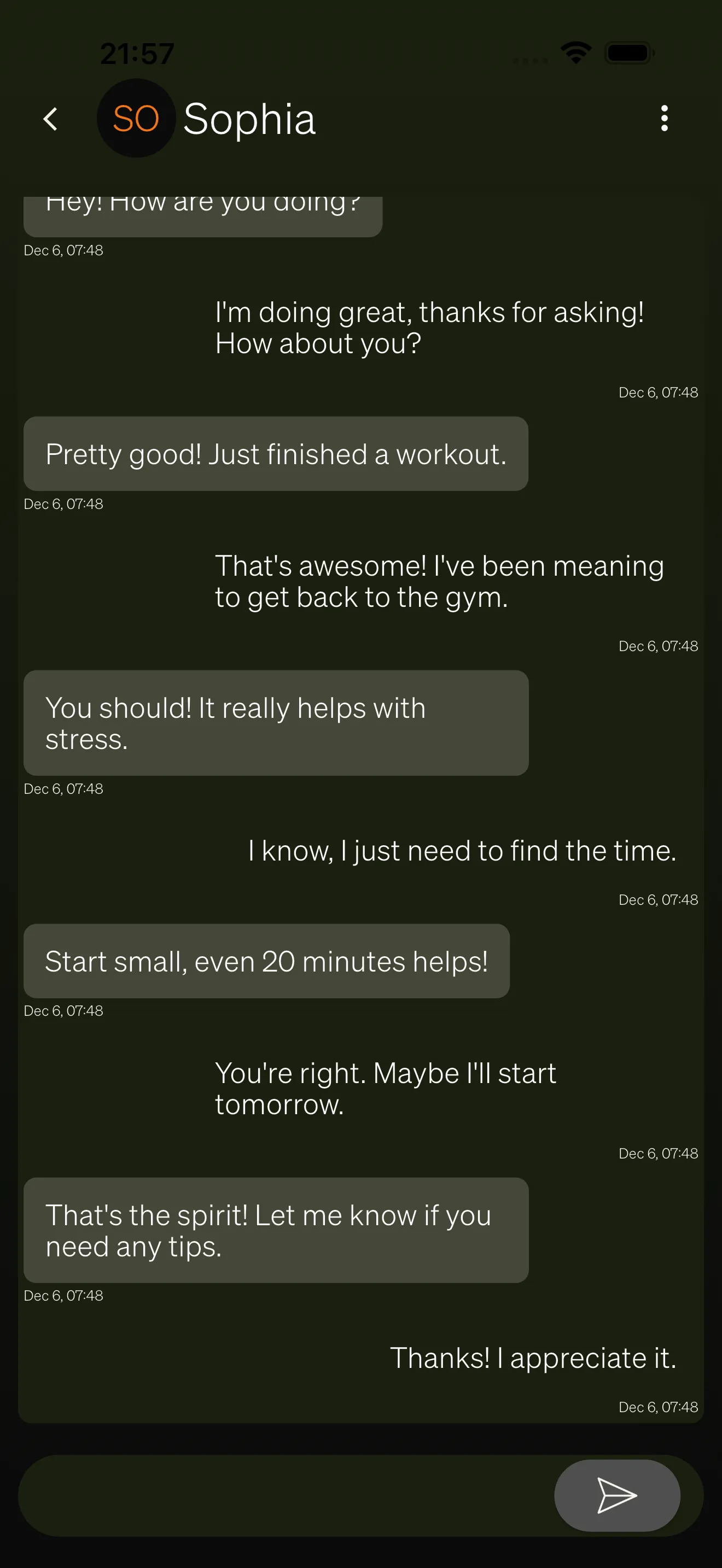
One-to-one messaging lets users have private conversations with other people on the platform. Messages are delivered in real time, so both participants see new messages as they arrive.
A chat conversation displays:
- Message bubbles — The user’s own messages and the other person’s messages appear in different colors.
- Timestamps — Each message shows when it was sent.
- Chat header — Shows the other participant’s name and profile picture.
- Message input — A text field at the bottom of the screen for composing and sending messages.
Chat overview
Section titled “Chat overview”The chat overview screen shows all conversations in two tabs:
- Chats — All active conversations, sorted by most recent message. Each entry shows the other person’s name, the latest message preview, and an unread indicator if there are new messages.
- Chat Requests — Incoming and outgoing chat requests (see below).
Chat requests
Section titled “Chat requests”Before users can start a conversation, one person must send a chat request to the other. This keeps messaging opt-in and prevents unwanted contact.
Chat requests are organized into three sections on the Chat Requests tab:
- Received — Requests from other users waiting for the user to accept or decline.
- Sent — Requests the user has sent that are still pending.
- Handled — Previously accepted or declined requests.
When a user accepts a chat request, a new conversation is created and both participants can start messaging immediately.
Articles
Section titled “Articles”Articles are written content published by administrators through the Backoffice. Users can discover articles in several ways:
- Featured article — A highlighted article displayed prominently on the Community tab with its cover image, title, and subtitle.
- Browse by topic — Topics group related articles together. Users can view all topics in a grid and tap a topic to see its articles.
- All articles — A grid view of every published article, sorted from newest to oldest.
Each article page includes:
- Cover image and title — Displayed at the top of the article.
- HTML content — The full article body, which can include text, images, videos, audio, and links.
- Tags — Topic tags displayed below the article content.
- Save button — A bookmark icon that lets users save articles for later. Tapping the icon again removes the saved article.
- Comments section — A threaded comment area below the article (see below).
Article comments
Section titled “Article comments”Users can leave comments on articles to share their thoughts or ask questions. Comments support a two-level threading model:
- Top-level comments — Comments posted directly on the article.
- Replies — Responses to a specific top-level comment. Tapping a reply indicator opens a dedicated thread view.
Each comment shows the author’s name, profile picture, timestamp, and content. Users can interact with comments through:
- Like — Tap the heart icon to like a comment. The like count is displayed next to the icon.
- Reply — Tap the reply button to write a response to a top-level comment.
- Delete — Users can delete their own comments after confirming through a dialog.
- Report — Users can report other people’s comments for inappropriate content.
Comments are loaded with pagination, so older comments load as the user scrolls.
Circles
Section titled “Circles”Circles are group spaces where users can interact with a smaller community. They are only visible when the Circles feature is enabled for your workspace.
The circles screen has three tabs:
- My Circles — Circles the user has joined. Tapping a circle opens its detail page.
- Discover — Public circles the user has not yet joined. Users can browse and join these circles.
- Invitations — Pending circle invitations. A badge shows the number of open invitations.
Circle detail
Section titled “Circle detail”Inside a circle, users can access:
- Members — A list of all circle members.
- Chats — Group conversations within the circle (when the Chat feature is enabled).
- Articles — Articles shared within the circle (when the Articles feature is enabled).
- Leave — Users can leave a circle through the menu at the top of the screen.
User profiles
Section titled “User profiles”Users can view other people’s profiles by tapping their name or profile picture anywhere in the app. A user profile displays:
- Profile picture and name — The person’s avatar and display name.
- Bio — A short description written by the user (hidden if the viewer has blocked this person).
- Send chat request — A button to initiate a chat request with this person (only shown on other users’ profiles).
Block and report
Section titled “Block and report”When viewing another person’s profile, two action buttons appear at the top of the screen:
- Block — Prevents all communication with this person. Blocking is confirmed through a dialog and can be reversed by tapping the block button again.
- Report — Flags a user for review by administrators. The reporter must provide a reason before submitting.